
“JCQ had nearly three decades of trust behind them. The job was to make every touchpoint look as solid as the work they deliver.”

Lu Aveitua
Brand Designer
“JCQ had nearly three decades of trust behind them. The job was to make every touchpoint look as solid as the work they deliver.”
Lu Aveitua
Brand Designer
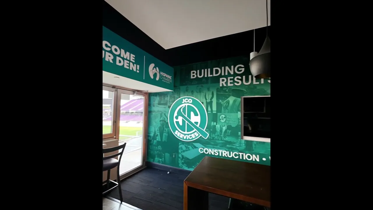
Since 1997, JCQ Services has grown from a general contractor into a multi-division company spanning construction, warehousing, logistics and investments. As the business expanded, its visual presence hadn’t kept up: different divisions, vehicles and documents spoke in different voices. I built a single brand system to carry JCQ across every surface, including a refreshed badge logo, brand guidelines, business cards, stationery and pocket folders, an environmental wall for their office, and a full fleet identity covering Teslas, pickup trucks, box trucks and trailers.
Since 1997, JCQ Services has grown from a general contractor into a multi-division company spanning construction, warehousing, logistics and investments. As the business expanded, its visual presence hadn’t kept up: different divisions, vehicles and documents spoke in different voices. I built a single brand system to carry JCQ across every surface, including a refreshed badge logo, brand guidelines, business cards, stationery and pocket folders, an environmental wall for their office, and a full fleet identity covering Teslas, pickup trucks, box trucks and trailers.

Creative сhallenges
One brand had to cover four very different businesses. A hard-hat construction crew and an investment meeting don’t usually share a look. I designed a badge-style mark that works for both: the J and C monogram sits inside a circular seal, and a claw hammer cuts through it to form the tail of the Q. The heritage of the construction trade becomes the signature of the whole company, while the seal format gives it the weight of an established institution.
The palette needed to feel grounded, not generic. Instead of the safety-orange and navy common in construction, I built the identity around a deep teal-to-petrol gradient with a golden accent line, a combination that reads as trustworthy and modern and stands apart on a job site, in a warehouse, or on the highway. The guidelines lock the logo in three approved versions so it stays consistent no matter who produces the next piece.


Brand in motion, fleet identity
JCQ’s vehicles are its biggest billboards, so I designed the fleet system to stay recognizable at any scale, from a Tesla Model Y to a 53-foot trailer. Each wrap uses a black base with two bold teal panels split by a narrow gap, a direct echo of the vertical line that divides the J and C in the logo. A sweeping arch shape carries the eye toward the badge, and the phone number and QR code are placed where they can actually be read in traffic.
For the trailers I developed two directions: Concept 01 keeps the clean panel system shared across the fleet, while Concept 02 turns the trailer into a moving ad with a direct call to action, “Ready to start your next big project?” Together with the stationery, cards and environmental wall, the fleet makes JCQ instantly identifiable whether a client meets them in the office, at a site, or on the road.
Latest projects
Branding
AI Services
Etika Global Consulting Branding
Visual identity and brand system for a bilingual insurance and immigration consultancy in Orlando.

Branding
AI Services
Etika Global Consulting Branding
Visual identity and brand system for a bilingual insurance and immigration consultancy in Orlando.
AI Services
Web design
TapFlow™ Digital Business Card
A QR-powered digital business card that saves your contact in one tap and captures theirs, built and automated inside GoHighLevel.

AI Services
Web design
TapFlow™ Digital Business Card
A QR-powered digital business card that saves your contact in one tap and captures theirs, built and automated inside GoHighLevel.
Latest projects
Branding
AI Services
Etika Global Consulting Branding
Visual identity and brand system for a bilingual insurance and immigration consultancy in Orlando.
AI Services
Web design
TapFlow™ Digital Business Card
A QR-powered digital business card that saves your contact in one tap and captures theirs, built and automated inside GoHighLevel.