We wanted a brand that made insurance and immigration feel less intimidating: clear, warm, and built on trust from the very first glance.

Lu Aveitua
Brand Designer
We wanted a brand that made insurance and immigration feel less intimidating: clear, warm, and built on trust from the very first glance.
Lu Aveitua
Brand Designer
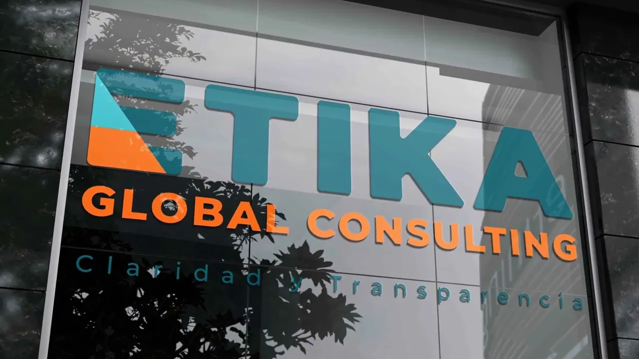
Etika Global Consulting helps families and individuals with health insurance and immigration paperwork. These are two areas where people often feel lost, anxious, or overwhelmed. The brand needed to communicate the company’s promise, Claridad y Transparencia (Clarity and Transparency), while feeling approachable to a diverse, largely Hispanic community in Orlando. The result is a complete identity system: logo, icon, color palette, gradient language, typography, photography direction, and social and print templates. Together they let Etika show up consistently everywhere, from Instagram to its storefront.
Etika Global Consulting helps families and individuals with health insurance and immigration paperwork. These are two areas where people often feel lost, anxious, or overwhelmed. The brand needed to communicate the company’s promise, Claridad y Transparencia (Clarity and Transparency), while feeling approachable to a diverse, largely Hispanic community in Orlando. The result is a complete identity system: logo, icon, color palette, gradient language, typography, photography direction, and social and print templates. Together they let Etika show up consistently everywhere, from Instagram to its storefront.

Creative сhallenges
Insurance and legal services tend toward cold, corporate visuals that create distance. Our challenge was to build credibility without losing warmth. We paired a solid, geometric wordmark in deep petroleum teal with energetic orange and golden yellow. The teal signals stability and the warm tones bring optimism and human connection.
The “E” icon carries the concept. Its stacked bars represent order and structure, and a diagonal cut of teal and orange shows complexity being broken down into clear steps. The icon works on its own as an avatar, a favicon, and a business card back. It holds up across six approved color variations, including single-color black and white.


User experience focus
Most of Etika’s audience meets the brand on social media first, so the system was built for fast, readable communication. Headlines in bold Montserrat take up 25–35% of the frame with tight leading. Short subheadlines follow in a human, positive tone, for example “Cada cliente es único” (Every client is unique). A clear hierarchy of size, weight, and color keeps every post scannable in seconds.
Photography focuses on real, spontaneous moments with warm light and diverse families. Translucent diagonal shapes in teal and yellow frame the subject without covering faces. The diagonal gradient, built from layered triangles rather than blur, became a recognizable signature. It ties together every touchpoint, from social posts to street posters and signage.
Latest projects
Branding
Print Design
JCQ Services Branding
Branding for JCQ Services: a bold, approachable identity built to stand out and build customer trust.

Branding
Print Design
JCQ Services Branding
Branding for JCQ Services: a bold, approachable identity built to stand out and build customer trust.
AI Services
Web design
TapFlow™ Digital Business Card
A QR-powered digital business card that saves your contact in one tap and captures theirs, built and automated inside GoHighLevel.

AI Services
Web design
TapFlow™ Digital Business Card
A QR-powered digital business card that saves your contact in one tap and captures theirs, built and automated inside GoHighLevel.
Latest projects
Branding
Print Design
JCQ Services Branding
Branding for JCQ Services: a bold, approachable identity built to stand out and build customer trust.
AI Services
Web design
TapFlow™ Digital Business Card
A QR-powered digital business card that saves your contact in one tap and captures theirs, built and automated inside GoHighLevel.